Skip to content
New issue

Have a question about this project? Sign up for a free GitHub account to open an issue and contact its maintainers and the community.

By clicking “Sign up for GitHub”, you agree to our terms of service and privacy statement. We’ll occasionally send you account related emails.

Already on GitHub? Sign in to your account

Remove box shadow from the default appender inserter button hover state #14936

Merged
merged 1 commit into from
Apr 12, 2019

Conversation

kjellr
Copy link
Contributor

@kjellr kjellr commented Apr 11, 2019

Fixes #14853.

This removes the box shadow on the inserter button that appears to the left of the default block appender (or to the right on mobile).

This brings the hover state in line with the hover state for the sibling inserter.

Before:
before

After:
after

Fixes #14853.

This removes the box shadow on the inserter button that appears to the left of the default block appender (or to the right on mobile).

This brings the hover state in line with the hover state for the sibling inserter.
@kjellr kjellr added [Type] Bug An existing feature does not function as intended [Priority] Low Used to indicate that the issue at hand isn't a top priority to address and can be handled later labels Apr 11, 2019
@kjellr kjellr requested a review from jasmussen April 11, 2019 19:57
@kjellr kjellr self-assigned this Apr 11, 2019
@kjellr kjellr changed the title Remove box shadow from the Remove box shadow from the default appender inserter button hover state Apr 11, 2019
@kjellr kjellr requested a review from mapk April 11, 2019 19:58
@kjellr kjellr added the Needs Design Feedback Needs general design feedback. label Apr 11, 2019
@kjellr
Copy link
Contributor Author

kjellr commented Apr 11, 2019

One design consideration here: This makes the inserter hover match that of the sibling inserter, but it also takes it out of a alignment with the hover state of the mover blocks that also appear on the left. I'm not sure that's actually better. 😕

before

(Also, I'm noticing for the first time that the inserter button shows up way to the left of where the block mover icons appear... that seems like a separate bug to fix. 😄)

@m-e-h
Copy link
Member

m-e-h commented Apr 11, 2019

I've always felt that a circle button with a circle icon felt a little forced. Kinda like wearing a bands t-shirt to the concert. 😄
Is there a style-guide related reason the circle + was the choice here?

  1. Circled icons reduce the size of the action symbol.
  2. Without a button outline or shadow, it's difficult for a user to tell how much button surface area they have to work with.

Wonder how this would look with a regular ➕ icon, in a round button with a border? It would essentially look the same but perhaps a little more noticeable/actionable?

@jasmussen
Copy link
Contributor

jasmussen commented Apr 12, 2019

One design consideration here: This makes the inserter hover match that of the sibling inserter, but it also takes it out of a alignment with the hover state of the mover blocks that also appear on the left. I'm not sure that's actually better.

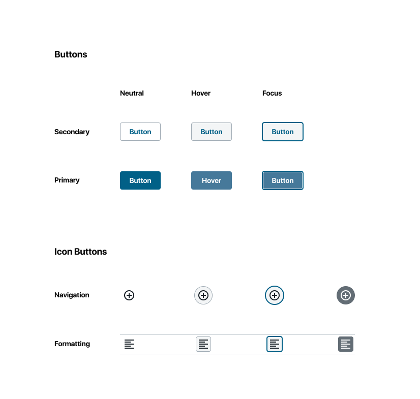
I think it's a small improvement, namely because the circle shape didn't work super duper for the inserter as Marty notes. I think this is better. But yes, let's definitely continue to iterate these style separately. I'm exploring SUUUPER early button hover/focus states in this screenshot, but they are so early that I share it only as a link not an inline image :D — but in any case, once we have a solid style for buttons, it'd be good to look at them all holistically.

One important consideration — the movers have backgrounds because they may overlap other content in nested situations (where even the neutral state has a background), like this:

Screenshot 2019-04-12 at 08 55 42

That neutral background doesn't look great at all, btw and is also worth tightening up. But no, the problem doesn't extend to the button this PR touches, because in nested contexts, the plus is inside, and on the right:

Screenshot 2019-04-12 at 08 55 46

Copy link
Contributor

@jasmussen jasmussen left a comment

Choose a reason for hiding this comment

The reason will be displayed to describe this comment to others. Learn more.

Ship it!

@kjellr
Copy link
Contributor Author

kjellr commented Apr 12, 2019

Thanks folks!

@kjellr kjellr merged commit aac1a37 into master Apr 12, 2019
@kjellr kjellr deleted the update/inserter-button-hover-state-for-left-inserter branch April 12, 2019 13:30
mchowning pushed a commit to mchowning/gutenberg that referenced this pull request Apr 15, 2019
Fixes WordPress#14853.

This removes the box shadow on the inserter button that appears to the left of the default block appender (or to the right on mobile).

This brings the hover state in line with the hover state for the sibling inserter.
@youknowriad youknowriad added this to the 5.5 (Gutenberg) milestone Apr 15, 2019
aduth pushed a commit that referenced this pull request Apr 16, 2019
Fixes #14853.

This removes the box shadow on the inserter button that appears to the left of the default block appender (or to the right on mobile).

This brings the hover state in line with the hover state for the sibling inserter.
This was referenced Apr 17, 2019
Sign up for free to join this conversation on GitHub. Already have an account? Sign in to comment
Labels
Needs Design Feedback Needs general design feedback. [Priority] Low Used to indicate that the issue at hand isn't a top priority to address and can be handled later [Type] Bug An existing feature does not function as intended
Projects
None yet
Development

Successfully merging this pull request may close these issues.

Add Block "+" icon has different hover effects
4 participants